Black and Gold Living Room Accessories That Sell Listings

A living room can look polished in person and still disappear in an MLS gallery. The sofa is clean, the floor is clear, and the photographer has a wide angle, but the image lacks contrast, a focal point, and any detail that makes a buyer pause. That's where black and gold living room accessories earn their place.
Used carefully, this palette gives agents a repeatable, portable staging system. Black creates definition in wide shots, while gold introduces small points of reflection that help a room feel considered and valuable. The goal isn't to decorate for personal taste. It's to build a composition that reads quickly on a phone, holds together in a wide room photograph, and still looks credible when a buyer zooms in.
Why Black and Gold Works for Listing Photos
A living room can photograph flat even when it feels finished in person. Pale walls, neutral upholstery, and several small accessories may merge into one soft field on an MLS thumbnail. A black frame, charcoal pillow, or dark vase gives the camera a clear edge. A controlled gold tray or lamp detail adds a stopping point without requiring new paint, built-ins, or furniture.
That makes the palette useful as a repeatable staging system. Black defines the room's structure in a wide shot, while gold supplies small reflective highlights. Agents can apply the same logic across different properties, then adjust the pieces to suit the room's existing finishes. This practical approach to black and gold interior decorating works best when placement and scale serve the photograph rather than personal taste.
The supply is also practical. Target's black and gold home decor collection includes wall art, frames, candle holders, vases, trays, bowls, bookends, and table accents. That range lets an agent assemble a consistent kit from portable pieces instead of relying on renovation work or property-specific furniture.

The palette creates a stronger thumbnail
The finishes do different jobs. Black grounds the frame, particularly beside light upholstery, cream walls, or pale flooring. Gold catches light in small areas, giving the photograph a point of interest instead of a broad, distracting shine.
Placement changes how each finish reads. A gold object against a dark surface can hold up in a detail crop. A black object near a light wall can outline architecture and clarify the room's shape. Together, the colors can suggest a formal, valuable room while keeping the accessory plan believable for a listing.
Guidance on opulent black and gold decor recommends using a black sofa or bookcase as an anchor, then adding gold through mirrors, sconces, candle holders, and framed art. The balance matters. Gold should mark selected points, not cover every surface. Buyers should see a polished room, not a themed display.
Photo rule: Use black to outline the composition and gold to reward the viewer's eye. If both finishes compete for attention, the room loses hierarchy.
Living-room staging warrants this control. Buyers' agents identify it as the top room-staging priority at 39%, ahead of the primary bedroom at 36% and kitchen at 30%, according to the National Association of Realtors staging information. The same report says 77% of buyers' agents considered listing photos much or more important to their clients. Accessories cannot rescue weak photography, but they can give the camera defined edges, controlled highlights, and a clear focal point.
Set Your Ratio Scale and Clearance Before You Accessorize
Start with the room, not the shopping list. A staging kit can contain beautiful pieces and still fail if the composition has too much black, scattered metallic finishes, or objects that interrupt movement. Before placing accessories, assess the dominant neutral foundation, the existing dark surfaces, and the areas where a small gold detail can create emphasis.
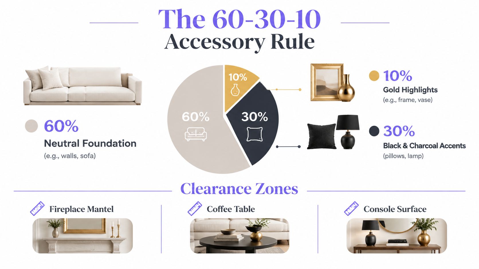
A useful working ratio is 60% dominant neutral, 30% black or charcoal, and 10% gold metallic accents, as outlined in this black-and-gold color scheme guide. Treat that as a visual control, not a mathematical requirement. Walls, rugs, sofas, and curtains usually supply much of the neutral field. Existing black cabinetry, a dark fireplace, lamps, pillows, and frames may already account for the secondary color before you add anything.
Complete a fast room audit
Walk the room from the likely camera position. Then check the same composition from the entry and the main circulation path. The accessory plan should support the room in all three views, not just from the sofa.
Identify the neutral foundation. Note the wall color, sofa upholstery, flooring, rug, and curtains. If the room is already visually busy, keep the accessories quieter. If it's pale and flat, black can provide the needed structure.
Count existing dark surfaces. A black media console, iron fireplace screen, charcoal sectional, and dark window trim already carry visual weight. Don't add a large black vase just because the palette calls for one.
Reserve gold for focal points. Choose the surfaces most likely to appear in photographs, such as a coffee table, mantel, console, or wall above the sofa. Gold should connect those zones rather than appear randomly throughout the room.
Check the dominant metal. Keep one primary metallic finish. If a second metal appears, use it only in small decorative pieces. Mixing bright gold, polished chrome, antique brass, and bronze across major fixtures often looks accidental on camera.
Protect movement and sightlines
A staged room still has to function. The planning guidance recommends at least 36 inches of walking space in main traffic paths and 18 inches between seating pieces. Verify those clearances with a scaled floor plan before buying or transporting objects, especially in compact living rooms where a single oversized accent chair can make every table feel crowded.
Use the same discipline on horizontal surfaces. A mantel should have visual breathing room, a coffee table shouldn't become an obstacle course, and a console shouldn't be so deep with objects that the entry path feels narrow. Space-planning basics can help agents assess furniture relationships before an accessory kit arrives at the property.
A photo-ready room needs negative space. Empty areas aren't wasted staging space, they're what let the black and gold details register.
Scale matters more than quantity. One substantial black vase can read better than several small objects scattered across a console. A slim gold frame may work above a narrow table, while a broad mantel needs an object with enough height to hold its own against the fireplace.
Where to Place Black and Gold Accessories for Maximum Photo Impact
Place accessories according to the room's visual hierarchy. Start with the largest anchor surface, then work down toward eye-level details and small vignettes. This prevents the common staging mistake of filling every available surface before checking whether the wide shot has a clear focal point.
Anchor the fireplace or media wall
The fireplace wall often becomes the natural destination of the buyer's eye. Use black to reinforce that anchor through a dark frame, fire screen, stacked books, or a matte vessel. Add gold in a single controlled detail, such as a thin mirror frame, a pair of modest candle holders, or a small sculptural object on the mantel.
Avoid lining the entire mantel with matching gold objects. Repetition can make the room look like a showroom display, and reflective pieces may create bright spots that compete with the fireplace. Keep taller objects toward one side and a lower supporting item toward the other, unless the architecture strongly favors symmetry.
If the room has a television above the fireplace, don't place shiny gold decor directly beneath the screen. The eye already has a dominant rectangle to process. A black object can visually connect the television to the mantel, while a warm metallic detail placed off-center adds refinement without turning the wall into a collection of competing rectangles.
Build the coffee-table foreground
The coffee table is one of the most valuable surfaces in a listing photo because it occupies the foreground of many seating shots. Use a black tray as the organizing base, then add a gold bowl, a neutral book stack, and one textural object such as linen, stone, or wood. The tray creates a boundary that keeps small items from reading as clutter.
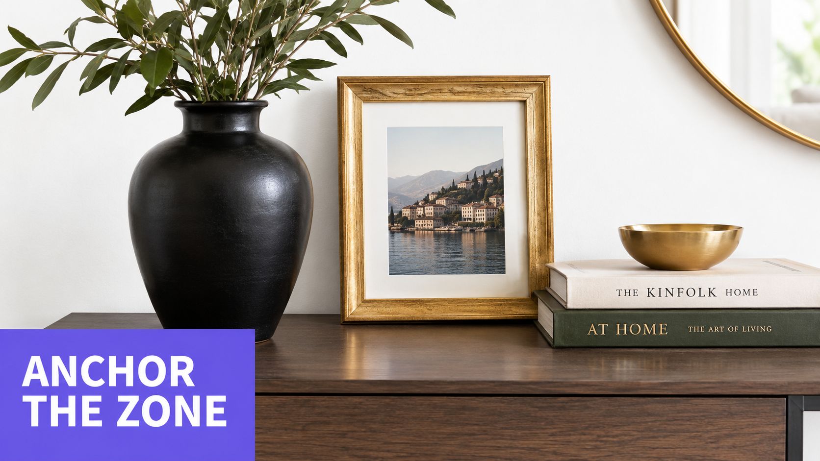
Keep the arrangement low enough that it doesn't block the sofa, fireplace, or windows from the main camera position. A black vase with airy branches can provide height, but dense foliage often becomes a dark blob in a wide shot. Choose branches that create an open silhouette.
Give the console a vertical moment
A console behind a sofa or along an entry wall needs height because it often sits beneath a large blank section of wall. Pair a black lamp base with a gold-framed print or mirror, then soften the arrangement with a neutral ceramic piece or a book stack. The dark base supports the composition, while the metal frame helps the wall detail appear in photographs.
Don't center every object mechanically. Let the wall art establish the main axis, then offset the accessories slightly so the vignette feels intentional rather than assembled from a template. If the console is visible from the front door, make sure the arrangement also looks finished from that angle.
Use shelves as rhythm, not storage
Open shelving gives you multiple opportunities to distribute the palette, but it also exposes clutter quickly. Place black objects on alternating shelves and reserve gold for isolated highlights. Leave some compartments partially empty, especially when the shelves already contain books or personal items.
Camera check: Take a quick phone photo from the photographer's expected position before finalizing the arrangement. If the black pieces merge into one heavy band or the gold objects flash brighter than the windows, edit before shoot day.
The best compositions create a path through the image. A dark frame may lead to a black vase, then a small gold bowl near the foreground. That repeated but uneven rhythm feels cohesive without making every zone identical.
Balance Texture and Light So Black and Gold Photographs Beautifully
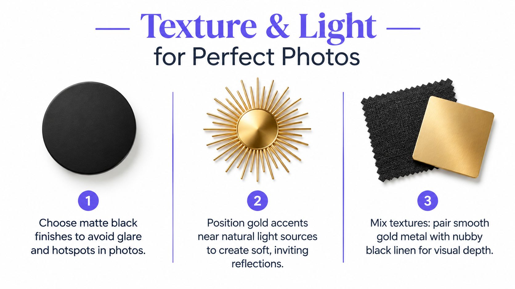
A black-and-gold room can look refined in person yet photograph as a dark block with random glare. Finish, texture, and light determine which result appears in an MLS image. Matte black usually preserves an accessory's shape more reliably than glossy black, which can reflect windows, lamps, and camera equipment as distracting hotspots.
Gold also needs control. Bright polished gold placed opposite a window or pointed lamp may create a hard reflection. Warm metallics, brushed finishes, antique brass, and softer bronze-leaning tones produce gentler highlights. Recent 2026 design coverage describes metals appearing more subtly in picture frames, lighting accents, and small decor. Bronze and softer gold-leaning finishes are also gaining ground as alternatives to bright gold, as reported by Elle Decor's living-room trends coverage.
Use texture to prevent visual heaviness
Give every black accessory a nearby surface variation. A matte black vase reads more clearly against nubby linen pillows, a woven basket, rough ceramic, or a charcoal bouclé throw. Without that contrast, the object can merge with a sofa or wall and appear as one uninterrupted dark shape.
Gold needs a quieter companion. Place smooth metal beside linen, ribbed glass, natural wood, or matte ceramic so the camera records more tonal information. Several glossy pieces in one vignette make the scene look reflective rather than luxurious, especially under bright room lighting.
For a faster guide to brightening dark rooms, address the room's overall exposure before adding more reflective accessories.
Layer the lighting
A single ceiling fixture rarely gives dark interiors enough separation. Combine practical lamps, sconces, fireplace lighting, and available daylight, then review the room from the planned camera position. A buyer's guide identifies finish consistency, socket accessibility, and fixture scale as key controls for black-and-gold lighting. It also recommends 800 to 1600 lumens and 2700K to 3000K warm light for most living spaces, as documented in this black-and-gold light fixture guide.
A staging-focused benchmark cites approximately 300 to 500 lux on black surfaces, more than 800 lux for gold-accent zones, and CRI 95+ at 2700K to keep dark luxury interiors balanced. Treat those figures as technical targets for a photographer or lighting professional. Flooding the room with artificial light can erase the contrast that gives black and gold definition.
Finish test: Stand where the camera will stand and check for reflected windows, white ceiling patches, and lamp hotspots. If a bright shape appears on the accessory, the camera will likely capture it too.
Stage It Faster With Virtual and Physical Workflows
Agents don't always have time to source, transport, place, adjust, remove, and return a complete accessory package. A photo-first system works better when physical and virtual staging serve different purposes.
Physical accessories are strongest when the home is occupied, the furniture already photographs well, and the room needs restrained finishing. A black tray, gold-framed art piece, and textured throw can add definition without changing the property's actual layout. They also help the photographer capture authentic shadows and reflections.
Virtual staging is more useful when the room is vacant, cluttered, dated, or difficult to furnish consistently across multiple listing photos. Start with a clean room image. Remove distracting furniture or personal items before adding a black sofa, charcoal rug, warm lamp, or restrained gold decor. The digital composition should respect the room's windows, architectural lines, and available floor area. Otherwise, the palette may look attractive while the image loses credibility.
Test the concept before hauling inventory
A practical workflow can run in this order:
Audit the original image: Identify the camera angle, strongest architectural feature, window direction, and areas where black or gold would disappear.
Create a restrained version first: Add only the major furniture and two or three accessory moments. A sparse draft reveals whether the room needs contrast or already has enough visual weight.
Compare physical and digital options: Use physical pieces for rooms with sound furniture and realistic access. Use virtual staging when sourcing would delay the listing or when several design directions need client approval.
Review every MLS-facing image: A palette that works in the living-room hero shot may look overdone in a hallway view or close crop. Keep the finish language consistent across the set.
Stage AI is an iOS app for real estate professionals that can remove furniture and personal items, apply design presets, or accept plain-English instructions such as adding a mid-century sofa and warm lighting. It can produce HD results for MLS, print, and social use, and agents can share finished images with clients or brokers. For this palette, an agent could test a black-and-gold living room concept before ordering or transporting physical accessories.
Use virtual results as a planning and marketing tool, not a substitute for disclosure or accurate representation. The furniture placement, scale, lighting, and architectural features should remain believable. When the physical room is ready, match the digital concept closely so buyers don't encounter a completely different visual story at the showing.
Your Next Listing Styled to Sell
Black and gold living room accessories work best when agents treat them as a system rather than a shopping theme. Neutral surfaces establish the room, black provides structure, gold creates selective emphasis, and texture keeps the contrast from becoming severe. Placement then determines whether the details support the architecture or add objects to a table.
The business case is tied to visualization. NAR's staging report says 83% of buyers' agents found that staging made it easier for buyers to visualize a property as a future home. It also reports that 31% of listing agents staged every home they listed, while 25% of respondents said staging greatly decreased time on market, according to the 2023 Profile of Home Staging.
Use this pre-shoot checklist
- Check the ratio: Confirm that neutrals dominate, black defines the composition, and gold remains a controlled highlight.
- Check the path: Protect the recommended 36-inch traffic clearance and 18-inch seating gap from the earlier planning audit.
- Check the focal surfaces: Give the fireplace, coffee table, console, or media wall one clear visual role each.
- Check the finish: Remove reflective black pieces and overly bright gold objects if they create glare.
- Check the camera: Photograph from the intended MLS angles and edit anything that merges into a dark mass or distracts from the room.
- Check the workflow: If sourcing is slow or the room is vacant, test a virtual version before committing to physical inventory.
Audit the next vacant living room before you buy anything. If the room already has strong dark architecture, add only warm metallic details and texture. If it's pale and forgettable, introduce black first, then use gold to guide attention toward the features buyers should remember.
Make this palette part of your repeatable listing toolkit. Test the arrangement, photograph it from the actual marketing angles, and keep only the pieces that make the room look clearer, brighter, and more valuable.
Use Stage AI to remove unwanted furniture, test a restrained black-and-gold living room concept, and create HD listing images without hauling every accessory to the property. Visit Stage AI before your next shoot to preview the composition, share it for client approval, and choose a physical staging plan with greater confidence.